Racines Carrées
An identity to help nature grow in the city: square shapes borrowed from urban architecture, drawn by hand to keep the human touch.
- Client
- Racines Carrées
- Sector
- Social enterprise, urban farming
- Year
- 2025
- Role
- Art direction & visual identity
- Deliverables
- Logo and variations, guidelines, graphic element library, posters
The starting point
The organization
Racines Carrées is a hybrid organization, part non-profit, part cooperative, part social enterprise. It designs and runs green spaces in the city: shared gardens, educational micro-farms, urban farming workshops, community composting.
The mission
A twofold mission: greening the city while fostering social inclusion and human connection, especially for vulnerable or isolated people. The identity had to speak to both.

The concept
Nature belongs in the city.
Show that nature can take root in the city, and that urban life blends easily with the natural world. The approach: take the name literally. Roots, vegetables and plants drawn in square, angular shapes, the ones found in urban landscapes, applied to forms that are organic in real life.
The moodboard
Flat illustrations of fruit and vegetables, bold colors and chunky type: a joyful, approachable direction, far from the expected "eco" clichés.

A handmade logo
A hand-drawn wordmark, always in cubic, angular shapes, to keep an authentic, human feel. Its letters echo the urban world of street art, and a beet, a carrot and a sprout, "square" too, ground it.
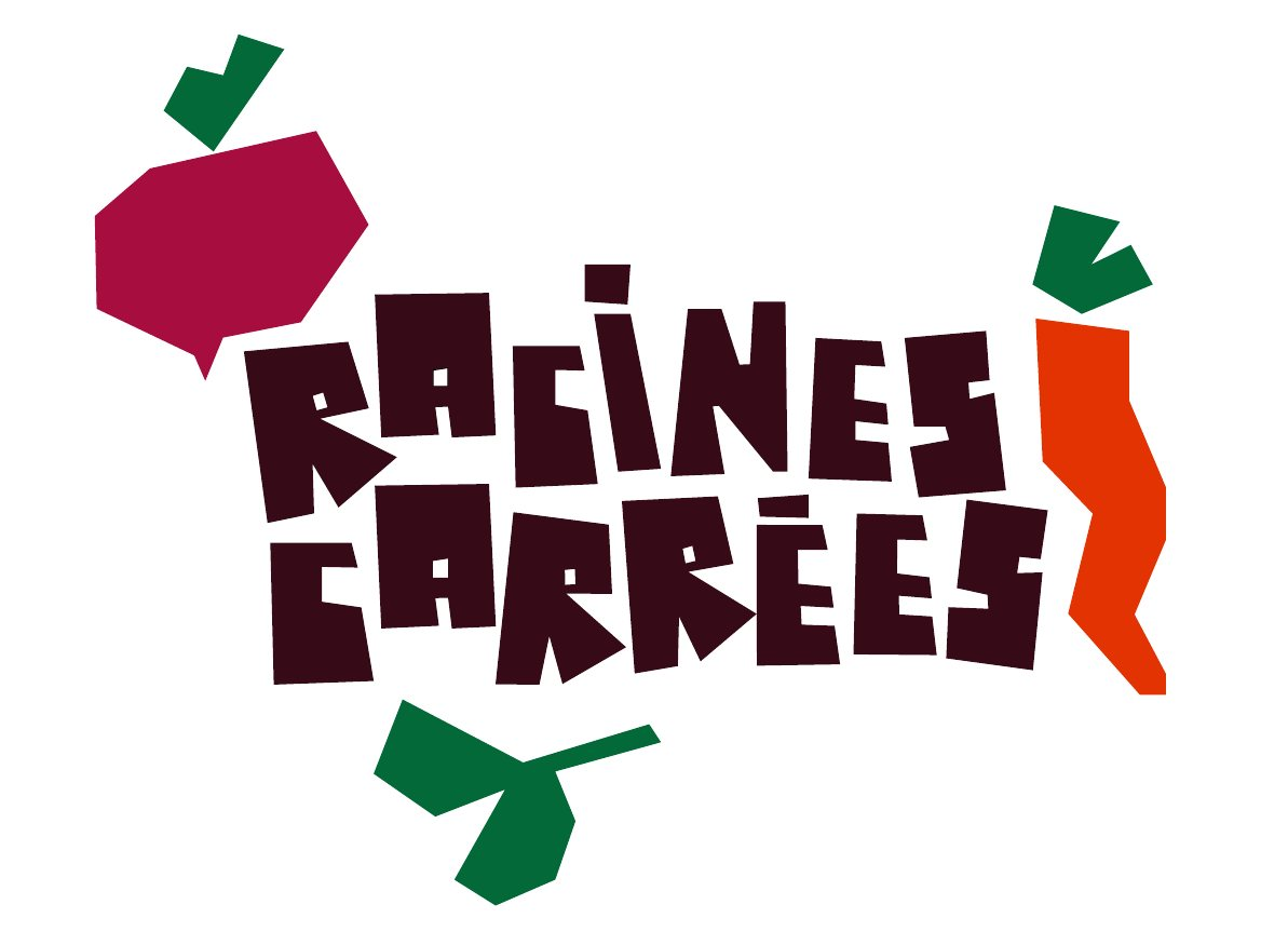

The full logo, then its badge and type-only versions, to fit every medium.
The palette
Four main colors, plus a secondary palette taken from the vegetables themselves for the illustrations.
Typography
Headings and hooks
Body text and practical info
An element library
Vegetables, fruit, plants and garden tools, all drawn with the same angles as the logo. They combine into patterns or work alone to dress any medium.
The city inside a vegetable
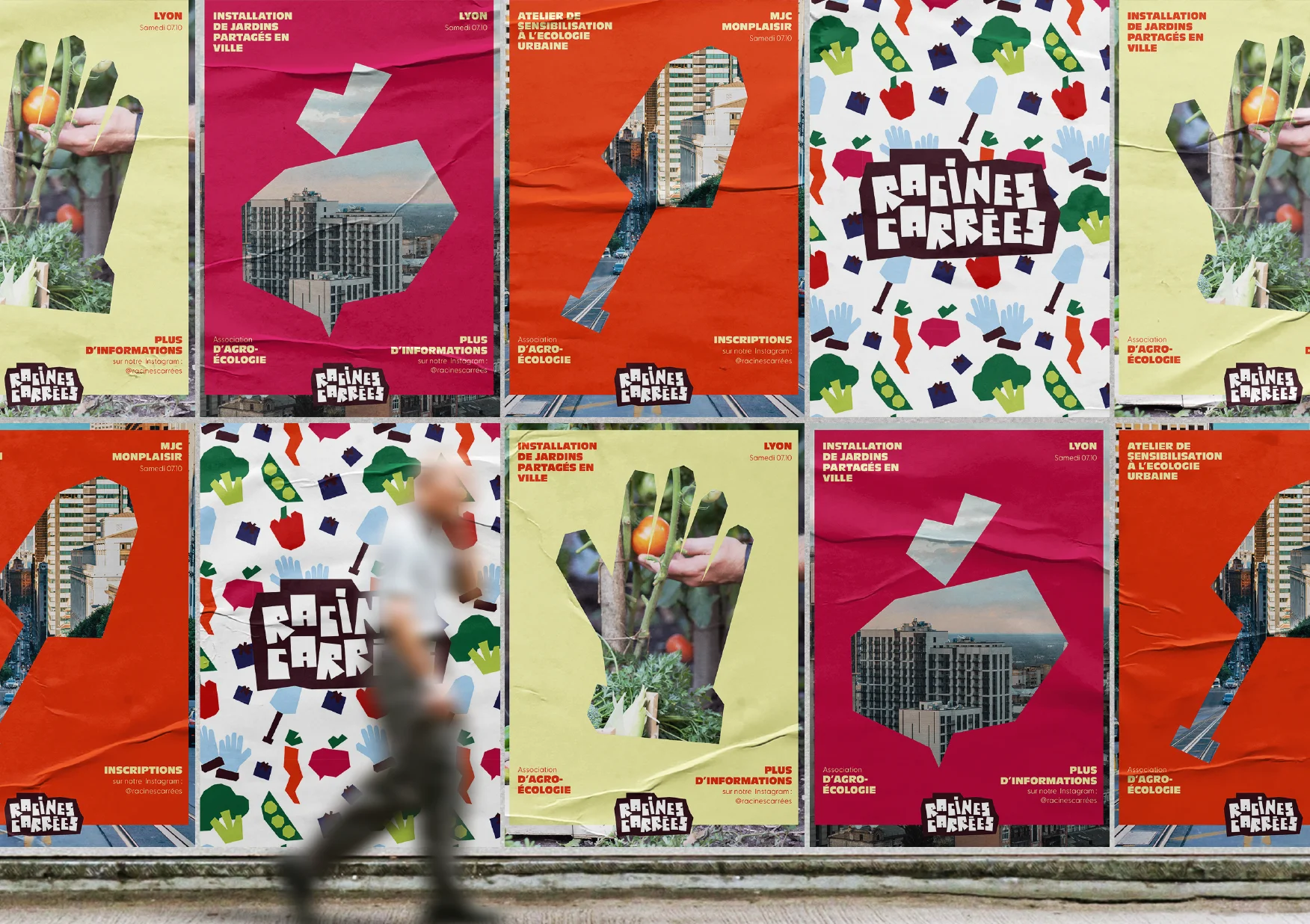
The posters build on the core idea: bringing nature into the city. Each square vegetable becomes a window onto a photo, sometimes buildings, sometimes hands in the soil.

The result
An identity that speaks of both city and nature, warm without being naive: a handmade logo, a bold palette and a family of elements to dress posters, social media and objects without ever breaking the guidelines.
- 1handmade logo and its variations
- 16graphic elements in the library
- 3event posters