MJC Monplaisir
An umbrella brand for a community arts center (MJC) and its two venues, built for everyday use by teams with no design background.
- Client
- MJC Monplaisir, Lyon (8th district)
- Sector
- Community programs, culture
- Year
- 2025
- Role
- Project lead & art director
- Deliverables
- Logos, brand book, design system, posters, social media assets
- Context
- Master's capstone project, done with the MJC team
The starting point
The context
MJC Monplaisir brings together two venues: the MJC itself and the Espace des 4 Vents. Two logos, two worlds, and communication handled every day by volunteers and staff, with no in-house designer or dedicated budget.
The challenge
Create an umbrella identity that clarifies the link between the two venues, strengthens members' sense of belonging and stays simple enough for anyone on the team to use.

The old identity: a cluttered logo that's hard to read ("OMJC" instead of "MJC") and becomes illegible at small sizes.
The concept
"One MJC, two venues."
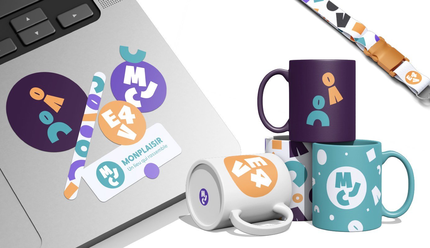
Rather than just a logo, a design system: shapes taken from the logo's lettering become motifs, patterns and little characters that embody the two venues. Playful without being childish, it draws on the visual language of community and cultural organizations and can be extended endlessly.
A logo that adapts
A full version with the tagline, a short version, then the badge alone for small formats. Each venue has its own color and badge under the same brand: you can tell them apart and understand they belong together.

The palette
The MJC's historic colors, modernized without losing what made them familiar to its community. They were adjusted for good contrast, checked with the UserWay tool.
Typography
For large headlines
Logo, body text, practical info
The brand world in action
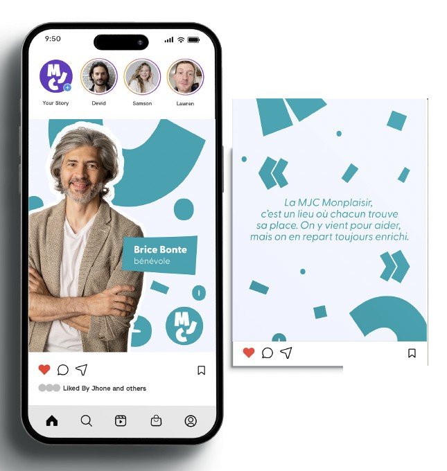
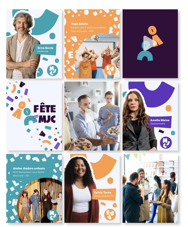
Simple shapes taken from the logo's letters, turned into patterns, characters and layout elements. Teams can combine them without ever breaking the guidelines.


The result
A complete, accessible and eco-conscious graphic system: two venues finally recognizable under one brand, and a clear brand book with simple rules so the team can create its own materials.
- 3adaptive logos, one per venue, under one brand
- 1brand book with usage rules and specifications
- ∞possible patterns, from shapes taken from the logo