BOM
A Korean skincare brand designed for French customers: simple, inclusive and as fresh as its name.
- Brand
- BOM, brand creation
- Sector
- Korean skincare, online retail
- Year
- 2024
- Role
- Graphic designer & art director
- Deliverables
- Naming, logo, brand guidelines, packaging for 3 ranges
- Context
- Student project, fictional brand

The starting point
The context
BOM sells Korean skincare routines online, with products imported straight from Korea. Its mission: demystify Korean skincare and make it simple and accessible in France.
The challenge
Stand out from brands like Typology or Yepoda, reassure people about the quality of imported products, and speak to every skin type, without making perfectly smooth skin the ideal.
Persona #1
Emma, 28, the busy professional
A consultant, always between two meetings. She wants an effective routine that fits her schedule.
Persona #2
Pierre, 35, the busy new dad
An engineer and new dad. He wants simple, safe products that take no time or effort.
The naming
"Bom" means spring in Korean: renewal, freshness. Easy to pronounce in France, short and effective, like the routines the brand offers.
Rejected name: "Haesoo" (living in the moment), more poetic but hard for a French audience to pronounce.
One logo, two alphabets
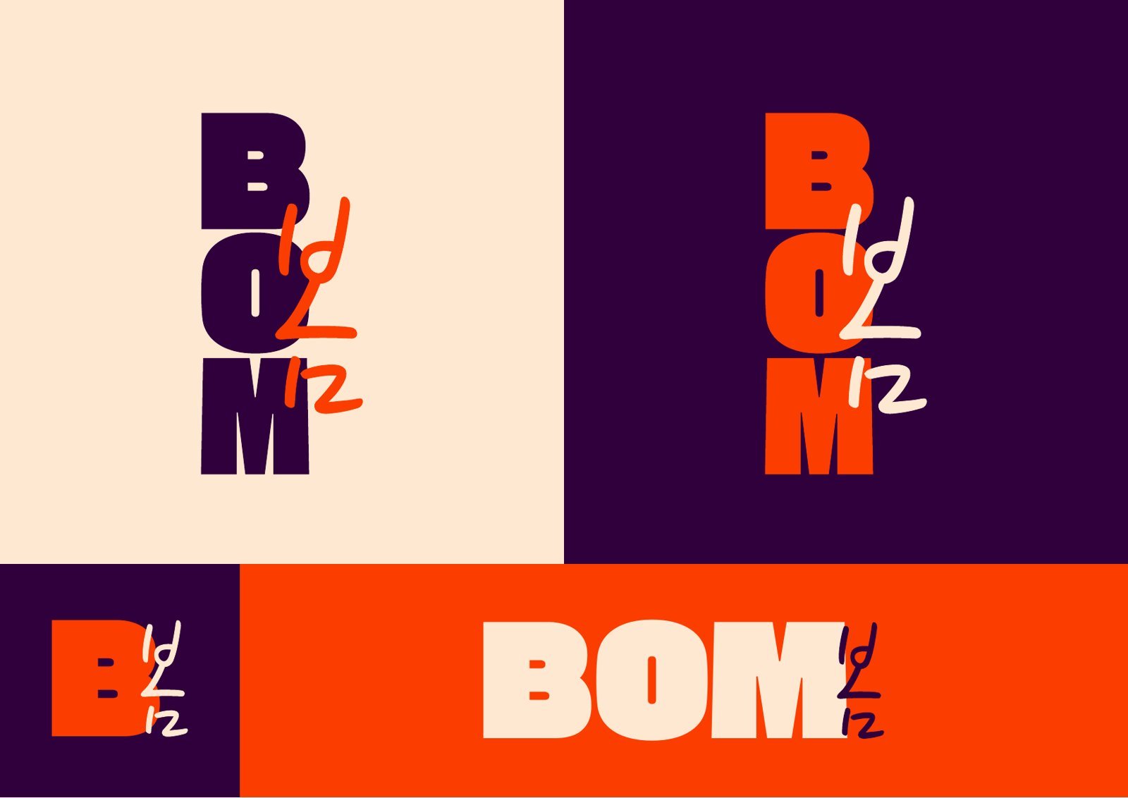
A very bold typeface, signed with a hand-drawn "봄": France and Korea in a single logo. It comes in vertical and horizontal versions, or as a simple "B", to fit every medium.

The palette
Three main colors for impact, and a broad secondary palette to represent every skin tone and give each range its own color.
Typography
Logo and headings
Tagline and annotations
Body text
Typefaces chosen for their Latin and Korean alphabets, so the two can be mixed across materials.
For every skin
The photography embraces close-ups, natural poses and bold colors. No retouched skin: diverse faces of every age, so everyone sees themselves in the brand.

3 routines, 3 ranges
To make choosing easy, the offer reads in two steps: a routine based on your level, then a range based on your skin's needs.
Beginners
3 steps
Foaming cleanser, moisturizer, sunscreen.
Intermediate
5 steps
Cleansing oil, cleanser, serum, moisturizer, sunscreen or night mask.
Experts
7 steps
The full Korean routine: double cleanse, toner, serum, eye cream, moisturizer, sunscreen or mask.
Boost
Radiance range
"Citrus boost, sublime glow!"
Splash
Hydrating range
"A splash of hydration, softness and passion!"
Fresh
Purifying range
"Radiant clarity, fresh and precious skin!"
The packaging
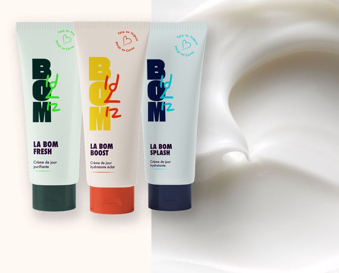
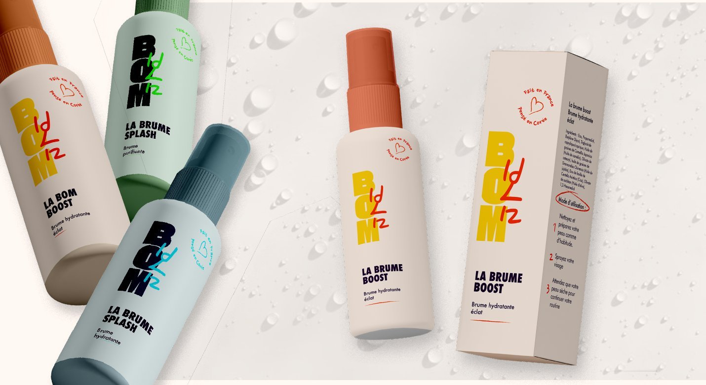
Cream, mist and mask: one system for the whole line. The vertical logo runs down each product, and the color shows the range at a glance.


The result
A complete brand, from name to packaging: a pop, bilingual identity that makes Korean skincare accessible, and a range system you understand without instructions.
- 3ranges, each with its own color
- 3packaging formats: cream, mist, mask
- 2alphabets, Latin and Korean, in one identity