Romane Gentilfreelance graphic designerSend me a briefFREN

Nostrum Care

Make health insurance interesting enough to stop the scroll. Two offers, two audiences, around thirty static ad concepts.

A project done in collaboration with Agence Short for its client Nostrum Care. A team handles strategy and messaging; I come in at the end of the process, as the designer who creates and produces the visuals.

Client
Nostrum Care
Context
In collaboration with Agence Short
Sector
Health insurance
Offers
Nostrum Vita and Bloomers
Platforms
Meta (Facebook, Instagram)
Formats
Square 1:1 and vertical 9:16
Role
Graphic designer: I design and produce the visuals
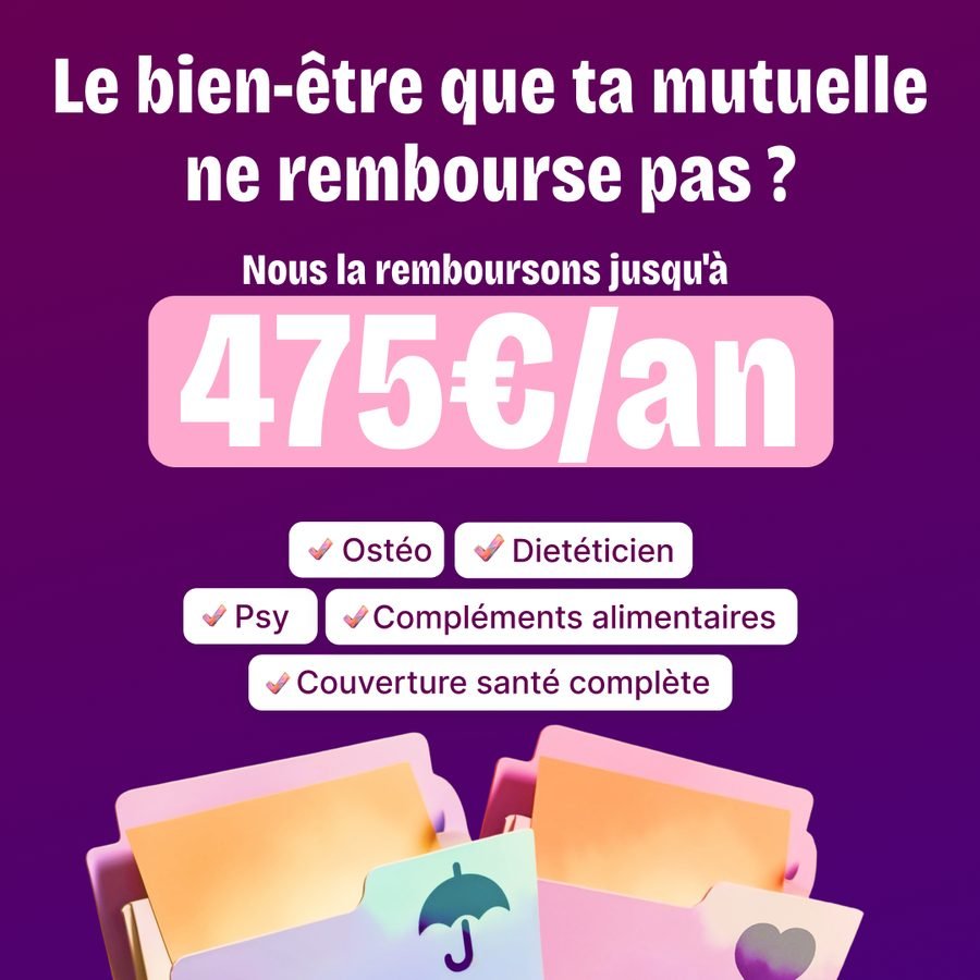
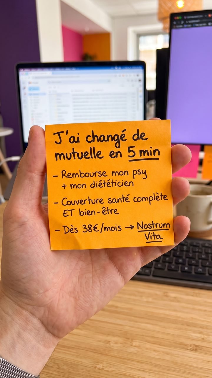
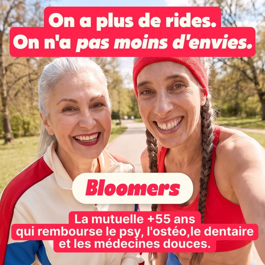
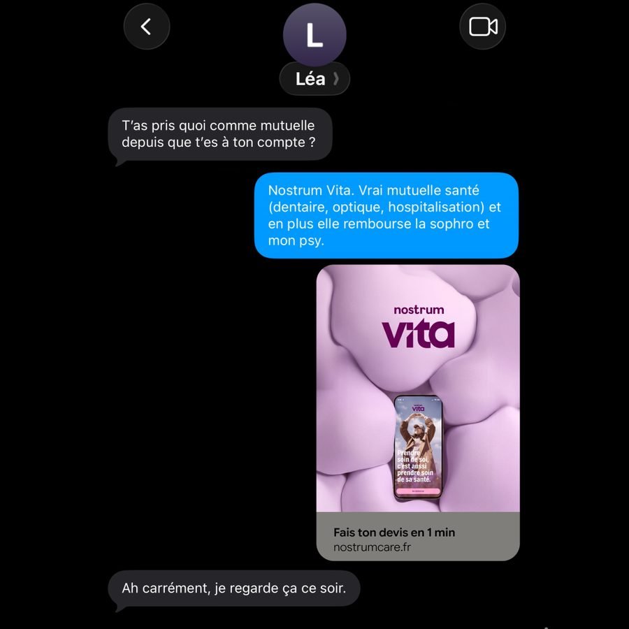
Nostrum Vita ad styled as a receipt: what the health plan covers, up to €475 a yearNostrum Vita ad: you see your sophrologist 3 times a yearNostrum Vita ad in 9:16: handwritten Post-it "I switched health plans in 5 min"Bloomers ad: more wrinkles, just as many plansNostrum Vita ad styled as an iMessage chat

The starting point

Nobody wants to hear about health insurance. The topic feels technical, the offers all look alike and the feed is saturated. The challenge: find, for each audience, a concrete reason to stop, then say it in one sentence.

Nostrum Vita

The self-employed and freelancers

A real health plan that also covers wellness: therapy, osteopathy, nutritionists and 40+ alternative therapies. The message: what other plans leave you to pay for, this one covers.

  • Direct, informal tone
  • Purple and pink
  • Native phone UI
Bloomers

People over 55 who aren't slowing down

"The health plan that makes you shine." Dental, hearing, physical therapy, alternative therapies: broad coverage for active seniors. The message: getting older is no reason to give anything up.

  • Formal, confident tone
  • Red and white
  • Real people, on the move

One concept, one lever

Rather than ten variations of the same visual, concepts that each pull a different lever. We run them side by side and the data tells us which one works. Here are four families.

01

Blend into the feed

A notification, a note, an article: the format looks like content, not advertising. People read it before realizing it's an ad.

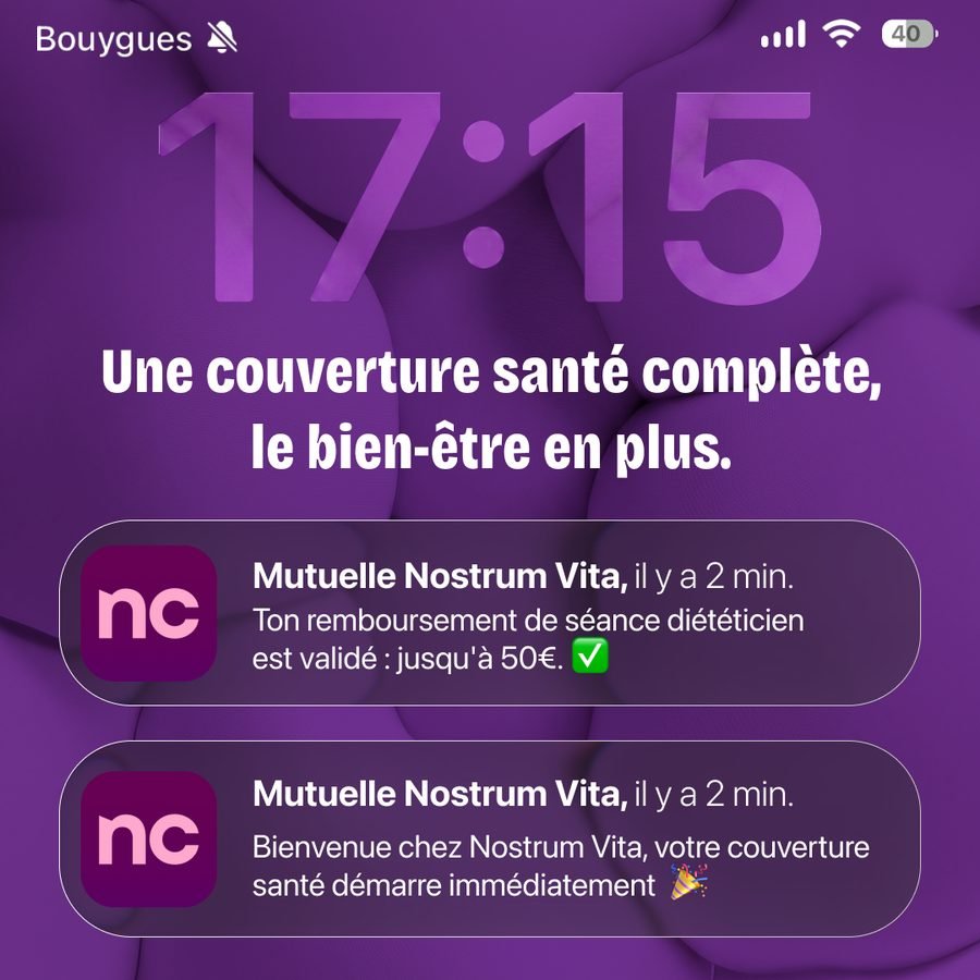
Ad styled as an iPhone lock screen with two Nostrum Vita notifications
iPhone notification
Ad styled as an iPhone note: "Coverage portability ends"
iPhone note
Ad styled as an online news article about a health plan that covers sophrology
Fake article
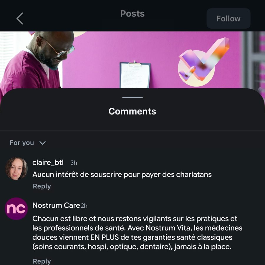
Ad styled as a comment thread, with the brand's reply to a critic
Reply to a comment
02

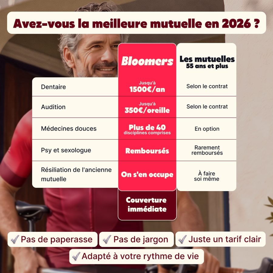
Compare

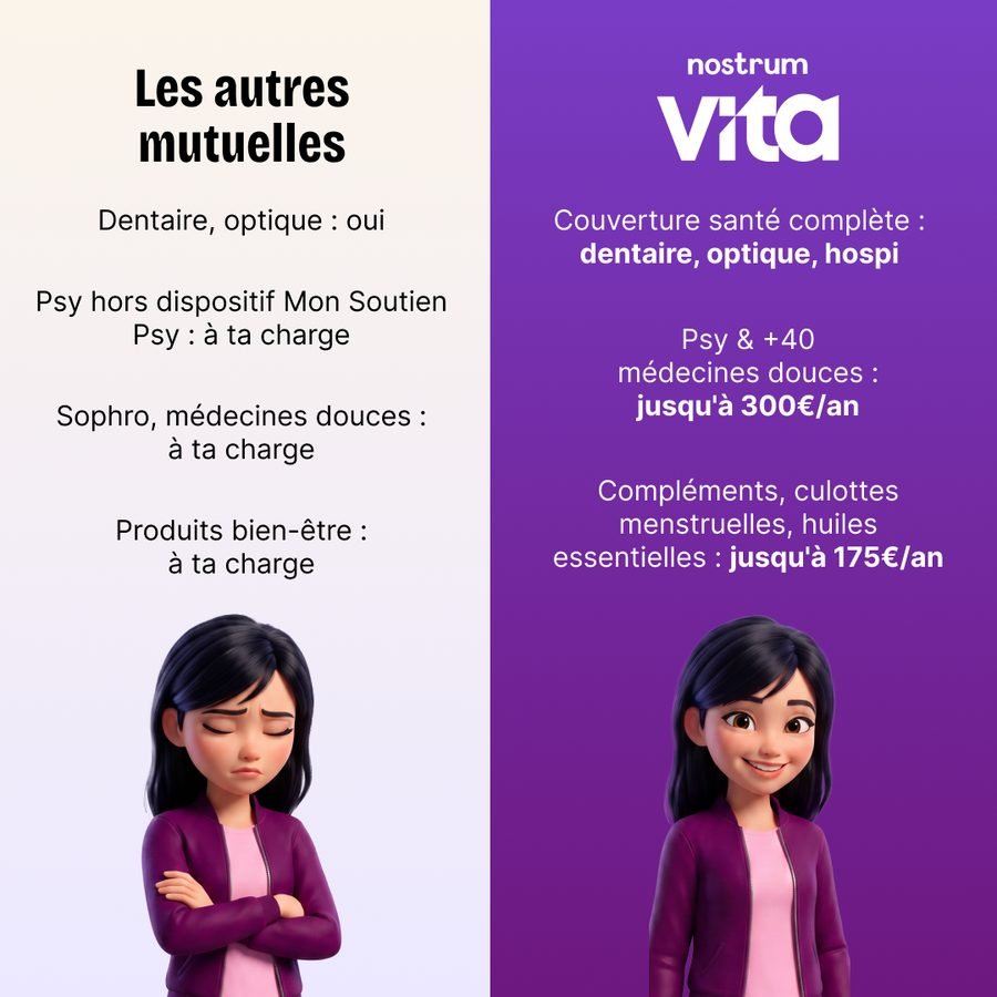
Put the offer next to "a standard health plan": the difference shows in two seconds, without reading the details.

Them vs Us ad: other health plans versus Nostrum Vita
Them vs Us
Comparison ad: a table of Nostrum Vita versus a standard health plan
Comparison table
With / without ad: what a standard health plan reimburses versus Nostrum Vita
With / without
Before and after ad: two portraits, before and after switching health plans
Before / after
03

Make the price concrete

"€38/month" means nothing to anyone. A receipt, a reimbursed session or a tax deduction does.

Ad styled as a receipt: the total wellness costs covered
Receipt
Price ad: a real health plan from €38 a month
The price, reframed
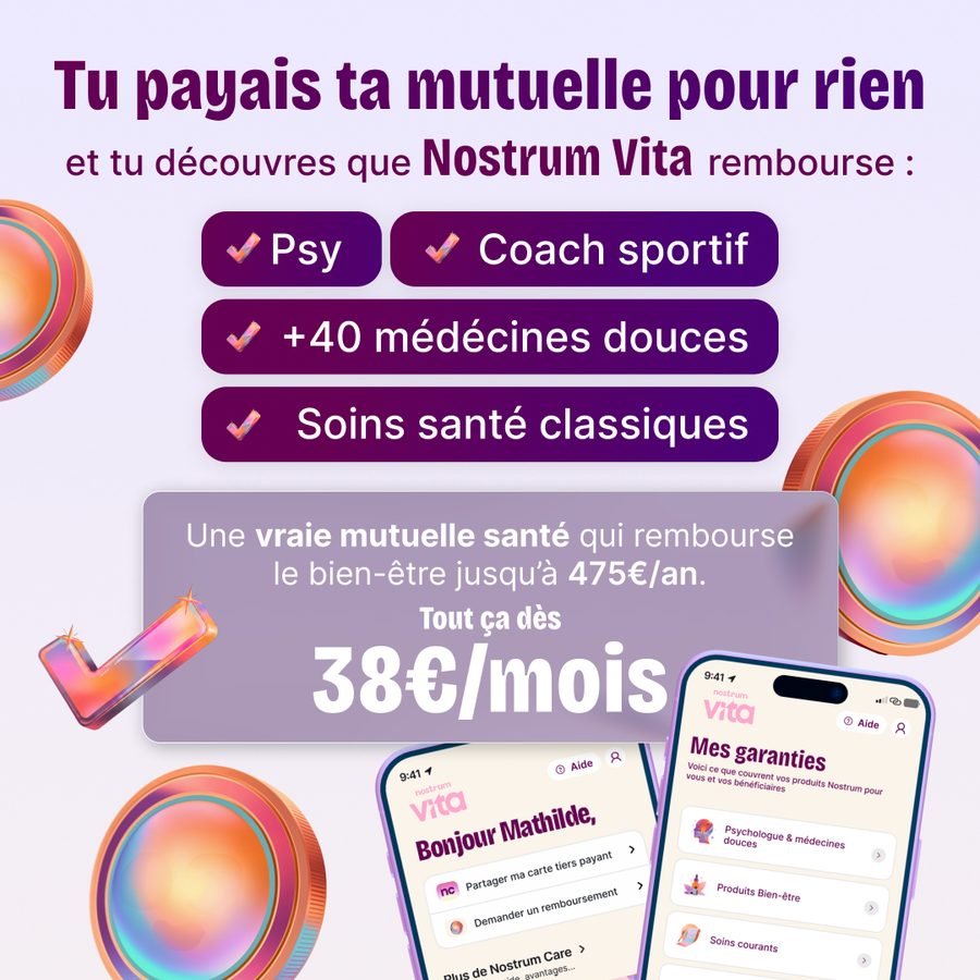
Ad: you were paying for your health plan for nothing
You were paying for nothing
Ad: your Nostrum Vita health plan, tax-deductible
Tax-deductible
04

Make it human

Hands, faces, handwriting: social proof lands better when it looks real, and the brand even owns up to what it isn't.

UGC-style ad: a woman shows her phone with her reimbursements
UGC-style static
Handwritten Post-it ad: I switched health plans in 5 min
Handwritten Post-it
Five-star customer review ad from a self-employed customer
Real-person testimonial
Mea culpa ad: we're not the cheapest health plan
Mea culpa

Same visual, different hook

Each concept comes in up to nine copy variants. The visual stays the same and only the hook changes, so we know exactly which argument gets the click. Try it:

The angle: the amount. €475 a year, in huge type.

Version A: wellness your health plan won't cover? Up to €475 a year

Designed for every format

Every concept is delivered in square for the feed and 9:16 for stories and reels. Not just a crop: the layout is reworked so the message stays clear of the areas covered by the interface.

iPhone notification ad, square formatiPhone notification ad, 9:16 format
iPhone notification, square and 9:16
Bloomers subway poster ad, square formatBloomers subway poster ad, 9:16 format
Bloomers, subway poster, square and 9:16

Bloomers: retirement at full speed

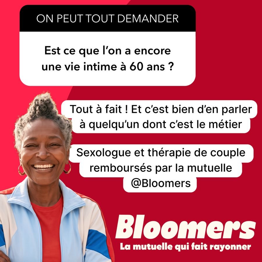
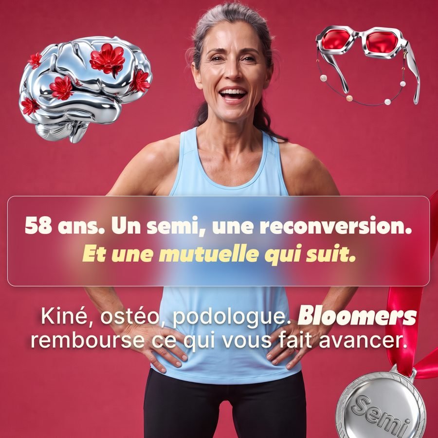
For people over 55, we drop the cliché of the retiree puttering in the garden. Real people, sports, humor, and the numbers that matter at that age (dental up to €1,500/year) in huge type.

Bloomers ad: your teeth never asked to retire, up to €1,500 a yearBloomers ad: I quit tennis, I switched my health plan to BloomersBloomers ad: do we still have an intimate life at 60?Bloomers ad: what your health plan should cover, a cyclist and his reimbursementsBloomers ad: do you have the best health plan in 2026? Comparison tableBloomers ad: 58, a half marathon, a career change, and a health plan that keeps up

The deliverable

A library of test-ready ads: each concept comes with several hooks in two formats, so the acquisition team can launch, compare and keep what works.

  • 22concepts for Nostrum Vita
  • 8concepts for Bloomers
  • ~300visuals delivered, including every copy variant and format
See the ad wallSend me a brief
Next projectNeutraliz